Blog Template, Again
After looking at it a few times, I do actually agree with some of my readers that the links were a bit difficult to see with the new template. So maybe I will change it again. Reader 'cuz has been kind enough to draft this suggested blog template. What do you think?
posted by Unknown @ 5:04 PM
![]()
![]()
13 Comments:
No doubt that the testsite is "more readable"...
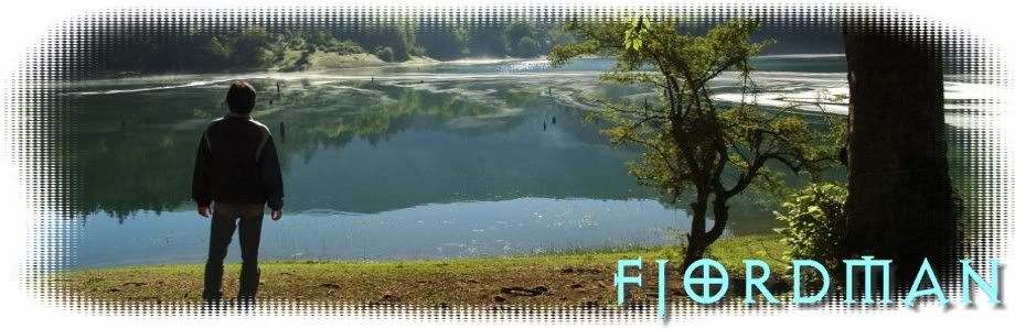
It sure is better, but the header shouldn't be that big.
Irene: I noticed the letters, and believe that symbol should be dropped, yes. Just the picture and some plain letters spelling out "Fjordman" would be nice. I like the colors and the basic set-up, though.
Ambok: The header could be slightly smaller, yes.
It is definitely easier to read, but I prefer your current format. If you could just figure out what to do about the blue links, it would be perfect. I found your blog about two weeks ago, it is one of the best I've read.
Cuz: Yes, originally it was a normal, Christian symbol. But most people today will have more negative associations with it. I had the same first reaction to it as Irene did. It's like the swastika used by the Nazis, which is an ancient Indian symbol. It can be misinterpreted, and since this is already a controversial blog, I don't need that.
I like it. Some finetuning with the colours to make it more interesting without losing its clear outline. Has my Approval.
Having just spent most of the day struggling to modify one of Blogger's templates for my own under-construction blog, I know how tiresome all the tweaking can be.
Basically the new look is attractive, more stylish than the previous one. I do think the type, both for the text of the posts and for the links, needs more contrast than the green-on-green provides.
I like the new template as well as the colors. I like the old letter style as well, however you have a point about its new connotation. Maybe you can take the cross out and leave the remainder of the letters as is? Not a tremendously big deal though. As for the picture, it is quite fine, however take a look at this site, coincidentally named "fjordman" as well, from Germany. There are some very nice pictures there of Norway and the fjords. I especially like those 3 stone swords. Overall though, the template is very nice.
http://www.fjordman.de/
Congrats Fjordman!!!
Goddammit, that's a cool new outlook! I particularly like the logo, and no, I don't mind the "O" resembling a Celtic Cross. Especially not when I'm reading that the Red Cross considers changing its symbol because it might offend "other cultures".
For me, you can keep it up. For the rest: go on man, your voice needs to be heard!
Outlaw Mike, Proud Fleming
The blue "Fjordman" is excellent. All your template lacks now is a periscope of an Al Qaida submarine in the fjord there.
fjordman: It'll do: Now: Please get on with the show! We read you for your content -- not your "body"! (smile) -- gunjam
I like the celtic cross in the name in the picture. All of the styles that you've shown are good for for me. The only thing that I had trouble with was the blue on green link.
Post a Comment
<< Home